
“progressive” Charts
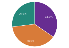
2007 Wealth Concentration in the United States »
This chart shows the percentage of total wealth held by each designated income group in 2007. Notably, just one percent…

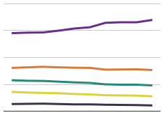
Rising Income Inequality in the US »
This chart measures each income group's share of total US income over time. From 1967 to 2012, the top fifth…
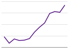
Rising Concentration of US Income in the Upper Classes »
This chart shows the US Gini Coefficient (or ratio), the measure of income inequality most widely used by economists, over…
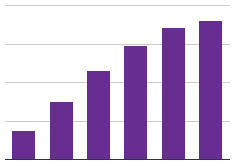
US Tax System is Moderately Progressive »
The more you make, the more you pay. However, many left-wing pundits claim that our tax system should be even…
